
Designing for Mendix: Components and Design Systems
A concise blueprint for unifying tokenized design systems, core layout templates, and custom interaction widgets across enterprise low-code ecosystems.
On This Page
1. The Low-Code Design Paradox
Low-code platforms speed up data binding and logic delivery. But when scaling to complex enterprise portals, teams hit a core paradox:
Complex workflows forced into rigid templates.
Inline overrides break global theme upgrades.
Uncoordinated widgets create fragmented UX.
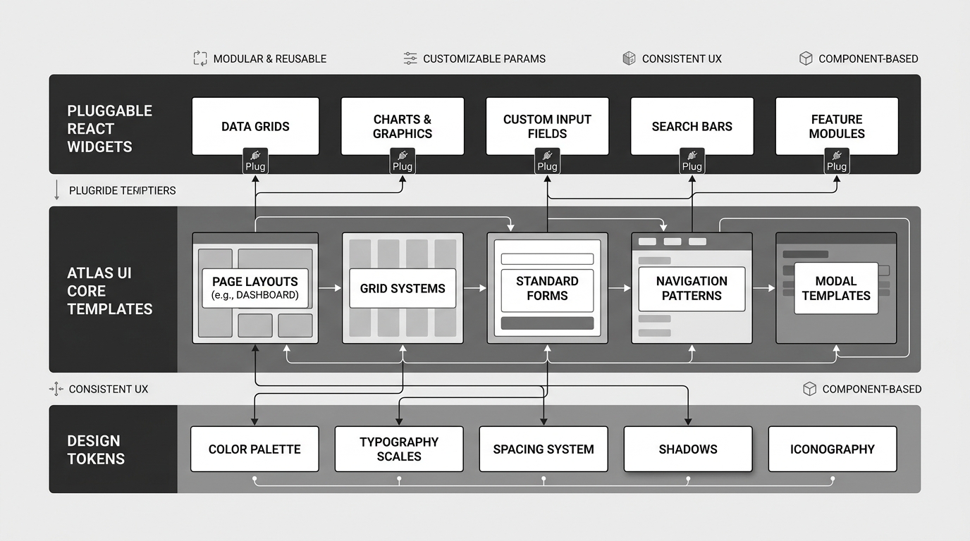
2. The 3-Tier Low-Code Stack
A layered architecture separates visual tokens, layout templates, and custom interaction widgets:
Figma variables mapped to global CSS variables for colors, typography, spacing, and radius.
Standard layout shells, building blocks, and studio properties in a centralized module.
Modular React micro-frontends for frozen data tables, live charts, and domain controls.
3. Studio Visual Guardrails
Architects configure predefined options inside the low-code studio so developers select styles from menus rather than writing custom CSS:
Dropdown options for Compact (28px), Standard (40px), or Spacious (52px) rows.
Visual toggles for Flat Border, Glass Blur Panel, or Raised Shadow.
Predefined Primary, Subtle, or Destructive actions with zero CSS drift.
4. Pluggable Interaction Modules
When stock low-code components cannot meet complex data visualization or dual-axis scrolling needs, teams build custom React pluggable widgets.
5. Multi-App Theme Governance
Across multiple enterprise applications, UI modules must be governed as a centralized product:
| Vector | Ad-Hoc Low-Code | 3-Tier UI Architecture |
|---|---|---|
| Theming | Manual per page | Single Token Source |
| Guardrails | Unrestricted CSS | Studio Dropdown Properties |
| Custom UX | Stock templates only | Pluggable React Widgets |
| Upgrades | High break risk | Clean Modular Releases |
6. Implementation Checklist
- Token Pipeline: Figma variables sync automatically to global CSS variables.
- Theme Module: Templates and building blocks packaged in a versioned UI module.
- Studio Properties: Density, elevation, and variants selected via studio menus.
- Widget Token Sharing: React widgets inherit colors, radius, and theme modes automatically.
- Accessibility: Keyboard focus traversal and WCAG AA contrast verified across components.

Written by Niraj Kumar
Pune, IndiaI design enterprise software and reusable interfaces at Schaeffler India.